
Monday, 24 January 2011
Prelim OFC
Here is my first OFC, for the Prelim task:


Magazine Research: "Kerrang!"
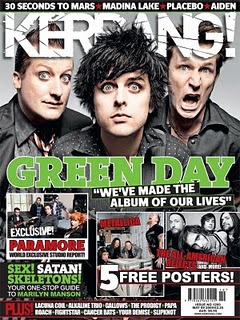 "Kerrang!" is a popular weekly rock magazine, which features a variety of top bands, and new undiscovered bands. It costs a reasonable £2.20, which is a suitable price for its target audience (see below).
The name "Kerrang!" name is a clever choice because it uses onomatopoeia so it sounds like a guitar power chord. It is published by Bauer Consumer Media and distributed by Gordon and Gotch.
Paul Rees was the editor from 2000-2003, however he left to edit "Q". He was replaced by Ashley Bird until 2005, then Paul Brannigan brought sales back up until 2009, where Nichola Brown now edits.
The main target audience are younger readers, especially teenagers; with 1.5% of people aged 15-44 reading "Kerrang!" whilst only 0.1% of the people aged 45+. 1.1% of men read it compared with 0.6% of women.
Bauer Media announced this as their Audience Profile: Individually minded, independent of thought and musically experienced, an audience defined by attitude, passion and loyalty.
Here is the e-booklet they have released about "Kerrang!": Bauer Media Digipak
-
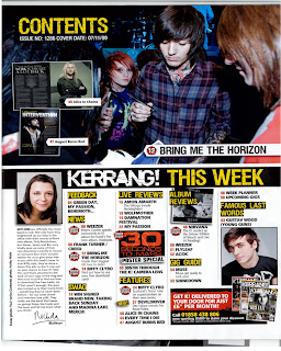
I found some of my old "Kerrang!"s and scanned the OFC's, the contents page, and some of the main articles so I could analyse the features that set it apart from other magazines. I'm going to do this with "Q", "NME" and "Total Guitar" as I have a few copies of each I can scan in. I'll have a look at some others on an images search and upload the most relevant ones.
Here are the "Kerrang!" OFCs I found:
2001, 2002, 2004:
2006, 2010 x 2:
2010 x 3, 2011:
Textual Analysis
The newer editions have far superior appearances, using more editing and more experimental designs with logos and colours etc. It is consistent because the logo is always at the top of the page, often partially covered by the main image, as the image is the demanding focal point, the main part in the sequence (followed by the deck/subhead). They all have many clear cover lines to show what's included in the magazine following a reasonable palette of usually red, white and black. Most "Kerrang!" OFCs have an image montage, alongside many clear cover lines to show the bands included inside the magazine. The main image is usually a mid shot of the artist(s).
"Kerrang!" represents its audience as loud, confident and passionate people. It puts everything into its design to suggest a wide variety of styles within the rock genre. It reflects a young audience with lots of life and vivacity.
Main Feature:
The main part of this article that interests me, is the last page. This is mainly because it uses more unconventional styles, including live photos as the main features. I intend to design my magazine to be a little unconventional but not to the point of being totally new. I want to incorporate several design styles to create my own version, putting together several familiar styles to the public, but combining them in a way that suits me, and my vision for my magazine.
The main part of this article that interests me, is the last page. This is mainly because it uses more unconventional styles, including live photos as the main features. I intend to design my magazine to be a little unconventional but not to the point of being totally new. I want to incorporate several design styles to create my own version, putting together several familiar styles to the public, but combining them in a way that suits me, and my vision for my magazine.
Contents:
Thursday, 20 January 2011
Prelim OFC Photo
I've chosen the photo I'm going to use for the school magazine. I've edited it in Picasa to make it brighter and more impressionable on the audience:

Next I'm going to add the logo and decks, then do some more research to decide what else to add.

Next I'm going to add the logo and decks, then do some more research to decide what else to add.
Prelim Research
I did some research for the school magazine prelim task. I searched up some examples of OFC's to get an idea of the layout needed. Here are a few that I found:


All of these magazine IFC's follow a unique house style that stops readers from being put off by a random array of colours/effects. Instead there is a consistent palette and similar fonts throughout. They all have a logo and several decks to show the main articles in the magazine. There is a clear banner area in each where it is appropriate to place the logo. I'm going to use all of these features in my magazine to make it as authentic as possible.
Experimental Ideas
This is only an idea of what to do, as I haven't posted the example magazines of my chosen genre - rock. I've collected some front covers and a few contents and main feature pages from rock magazines such as "Kerrang!", "Q", and "NME" etc. I will upload these soon with my notes.
In the meantime, I know it's not strictly speaking the actual task (as the Prelim is a school magazine) but I wanted to have a try and here's what I did with one of my photos:
I made this using Picasa and Picnik to combine the photos and text, and to add the downloaded barcode. I'm going to check this against my earlier rock magazine and make some different versions before I decide on the actual design.
Wednesday, 19 January 2011
A Few More Experimental Shots
I also took a few more shots I thought would look reasonable as part of the main feature in a magazine:
I experimented using these glasses as part of the mise-en-scene. Although these shots have nothing to do with the actual project, I think it's helping me to try different things so I'll be able to get the jusl right shot for the final piece (hopefully!).
I took some two shots of some friends, again to trial ideas for the magazine:
I quite like the idea of the two shot with the subjects looking at the camera, I'm going to try some more of these, with added lighting and editing afterwards. In the second one, I tried to create shallow focus, but at the time I didn't know how to so it's not as good as it could be. I'm going to re-create a shot like this one using the technique I have now learnt to properly create shallow focus.
Hello :)
Hi, I'm Becky and this is my Media Studies AS blog.
I've recently become interested in photography, and have been taking some test shots with various SLR cameras. I took some of a few friends as practise for the coursework in print. All of my photos will be uploaded to My Flickr Account, and I'll post the most relevant ones here:

I thought these were relevant because after I took them I could imagine them as magazine covers. With this type of shot I think spaces for text can be indentified to fit in with the background. For example for these two shots, this is how I would arrange them:


I thought these two worked in a similar way, however the next one I took I wasn't so happy with. I prefer mid shots, and close ups for magazine covers, and I felt this one was too close, and wouldn't have as much room for text, were I to use it:
I could see that it might be okay if the logo was at the top left, with the headings going down the right hand side to the bottom right corner. As I am doing a music magazine for my coursework, I don't think I'll be using this kind of shot, because most music magazines I've seen have mid shot photos, generally with the subject posing to the camera as a promotional photo, or a live shot from a gig.
I'm going to do some research into music magazines, and different music genres, before I decide which to do, and how to design it.
I've recently become interested in photography, and have been taking some test shots with various SLR cameras. I took some of a few friends as practise for the coursework in print. All of my photos will be uploaded to My Flickr Account, and I'll post the most relevant ones here:

I thought these were relevant because after I took them I could imagine them as magazine covers. With this type of shot I think spaces for text can be indentified to fit in with the background. For example for these two shots, this is how I would arrange them:
- For the first one I would put a logo in the top left hand corner, with text headings down the left hand side and a barcode in the bottom right hand corner.
- For the second one I would put the logo would be at the bottom left, with the headings along the left of the page.


I thought these two worked in a similar way, however the next one I took I wasn't so happy with. I prefer mid shots, and close ups for magazine covers, and I felt this one was too close, and wouldn't have as much room for text, were I to use it:
I could see that it might be okay if the logo was at the top left, with the headings going down the right hand side to the bottom right corner. As I am doing a music magazine for my coursework, I don't think I'll be using this kind of shot, because most music magazines I've seen have mid shot photos, generally with the subject posing to the camera as a promotional photo, or a live shot from a gig.
I'm going to do some research into music magazines, and different music genres, before I decide which to do, and how to design it.
Subscribe to:
Comments (Atom)


