Showing posts with label Experimental ideas. Show all posts

Thursday, 20 January 2011

Experimental Ideas

This is only an idea of what to do, as I haven't posted the example magazines of my chosen genre - rock. I've collected some front covers and a few contents and main feature pages from rock magazines such as "Kerrang!", "Q", and "NME" etc. I will upload these soon with my notes.
In the meantime, I know it's not strictly speaking the actual task (as the Prelim is a school magazine) but I wanted to have a try and here's what I did with one of my photos:

I made this using Picasa and Picnik to combine the photos and text, and to add the downloaded barcode. I'm going to check this against my earlier rock magazine and make some different versions before I decide on the actual design.

Wednesday, 19 January 2011

A Few More Experimental Shots

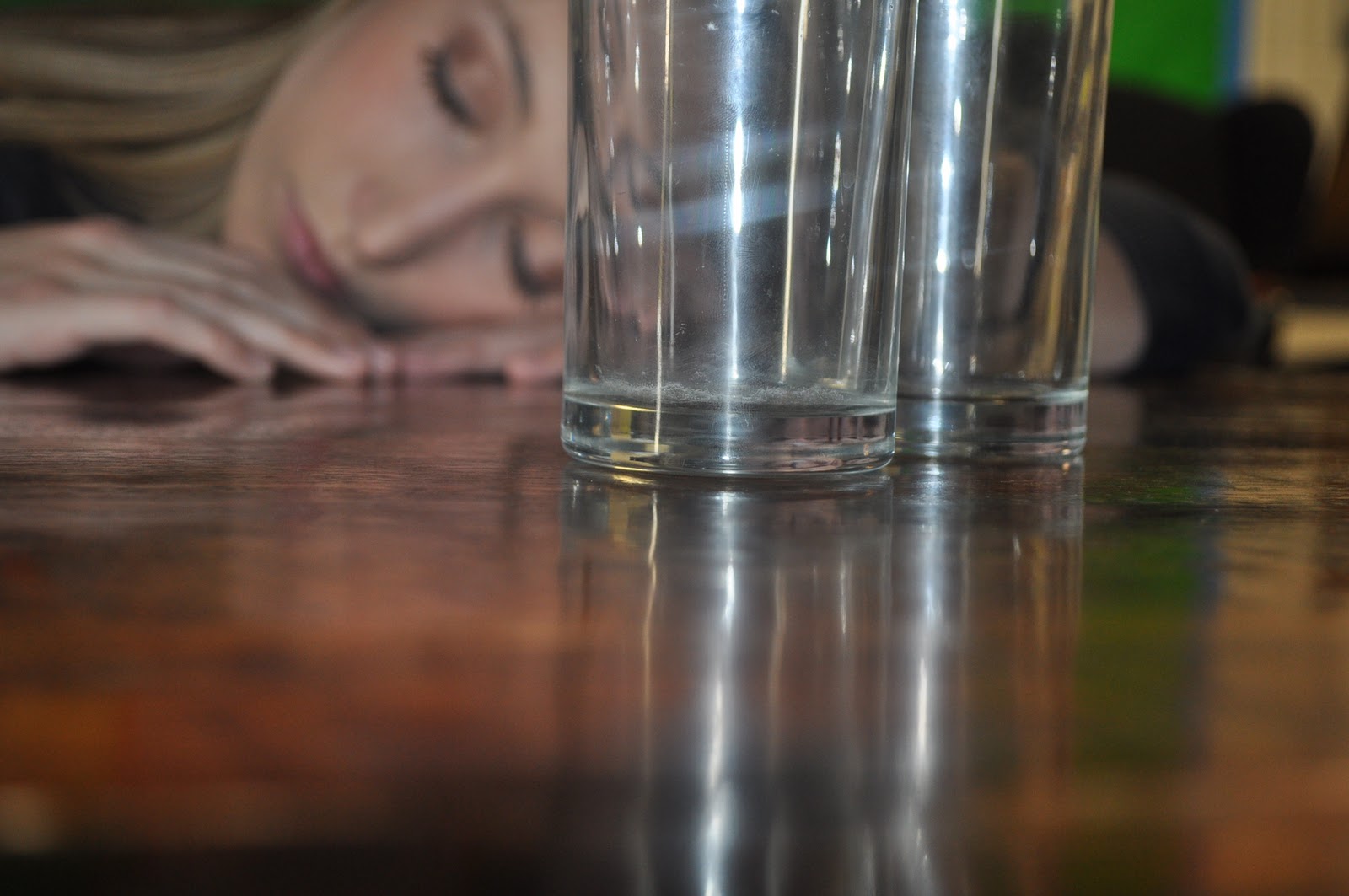
I also took a few more shots I thought would look reasonable as part of the main feature in a magazine:


I experimented using these glasses as part of the mise-en-scene. Although these shots have nothing to do with the actual project, I think it's helping me to try different things so I'll be able to get the jusl right shot for the final piece (hopefully!).


I took some two shots of some friends, again to trial ideas for the magazine:

I quite like the idea of the two shot with the subjects looking at the camera, I'm going to try some more of these, with added lighting and editing afterwards. In the second one, I tried to create shallow focus, but at the time I didn't know how to so it's not as good as it could be. I'm going to re-create a shot like this one using the technique I have now learnt to properly create shallow focus.


Hello :)

Hi, I'm Becky and this is my Media Studies AS blog.
I've recently become interested in photography, and have been taking some test shots with various SLR cameras. I took some of a few friends as practise for the coursework in print. All of my photos will be uploaded to My Flickr Account, and I'll post the most relevant ones here:


I thought these were relevant because after I took them I could imagine them as magazine covers. With this type of shot I think spaces for text can be indentified to fit in with the background. For example for these two shots, this is how I would arrange them:

  • For the first one I would put a logo in the top left hand corner, with text headings down the left hand side and a barcode in the bottom right hand corner.
  • For the second one I would put the logo would be at the bottom left, with the headings along the left of the page.
I liked the way they had space for text nearing one edge, so I took a few more to experiment:


I thought these two worked in a similar way, however the next one I took I wasn't so happy with. I prefer mid shots, and close ups for magazine covers, and I felt this one was too close, and wouldn't have as much room for text, were I to use it:


I could see that it might be okay if the logo was at the top left, with the headings going down the right hand side to the bottom right corner. As I am doing a music magazine for my coursework, I don't think I'll be using this kind of shot, because most music magazines I've seen have mid shot photos, generally with the subject posing to the camera as a promotional photo, or a live shot from a gig.


I'm going to do some research into music magazines, and different music genres, before I decide which to do, and how to design it.