 "Kerrang!" is a popular weekly rock magazine, which features a variety of top bands, and new undiscovered bands. It costs a reasonable £2.20, which is a suitable price for its target audience (see below).
The name "Kerrang!" name is a clever choice because it uses onomatopoeia so it sounds like a guitar power chord. It is published by Bauer Consumer Media and distributed by Gordon and Gotch.
Paul Rees was the editor from 2000-2003, however he left to edit "Q". He was replaced by Ashley Bird until 2005, then Paul Brannigan brought sales back up until 2009, where Nichola Brown now edits.
The main target audience are younger readers, especially teenagers; with 1.5% of people aged 15-44 reading "Kerrang!" whilst only 0.1% of the people aged 45+. 1.1% of men read it compared with 0.6% of women.
Bauer Media announced this as their Audience Profile: Individually minded, independent of thought and musically experienced, an audience defined by attitude, passion and loyalty.Here is the e-booklet they have released about "Kerrang!": Bauer Media Digipak-
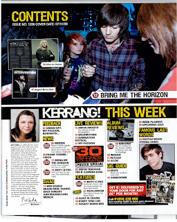
I found some of my old "Kerrang!"s and scanned the OFC's, the contents page, and some of the main articles so I could analyse the features that set it apart from other magazines. I'm going to do this with "Q", "NME" and "Total Guitar" as I have a few copies of each I can scan in. I'll have a look at some others on an images search and upload the most relevant ones.
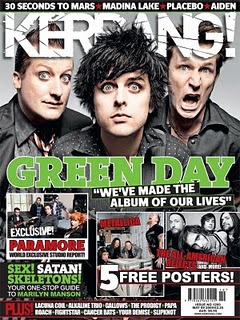
Here are the "Kerrang!" OFCs I found:
2001, 2002, 2004:
Textual Analysis
The newer editions have far superior appearances, using more editing and more experimental designs with logos and colours etc. It is consistent because the logo is always at the top of the page, often partially covered by the main image, as the image is the demanding focal point, the main part in the sequence (followed by the deck/subhead). They all have many clear cover lines to show what's included in the magazine following a reasonable palette of usually red, white and black. Most "Kerrang!" OFCs have an image montage, alongside many clear cover lines to show the bands included inside the magazine. The main image is usually a mid shot of the artist(s).
"Kerrang!" represents its audience as loud, confident and passionate people. It puts everything into its design to suggest a wide variety of styles within the rock genre. It reflects a young audience with lots of life and vivacity.
Main Feature: The main part of this article that interests me, is the last page. This is mainly because it uses more unconventional styles, including live photos as the main features. I intend to design my magazine to be a little unconventional but not to the point of being totally new. I want to incorporate several design styles to create my own version, putting together several familiar styles to the public, but combining them in a way that suits me, and my vision for my magazine.
Contents:
 "NME" or "The New Musical Express", is a popular music magazine. It was first published on 7th March 1952 by "IPC Media". It changed the music magazine scene, by introducing a singles chart for the first time(14/11/1952 edition). In the 1970's it gained the "Best-Selling British Music Magazine" title. "NME" began its life as a non-glossy tabloid format on standard newsprint, named "Musical Express and Accordion Weekly"; but when bought by London Music Promoter Maurice Kinn, it was relaunched as "NME"