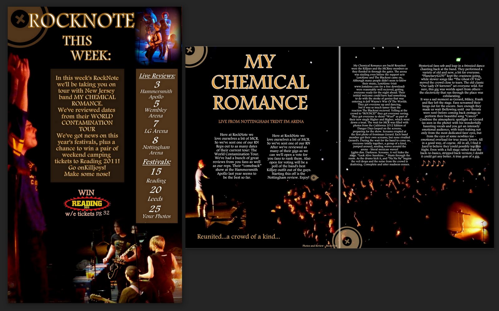
I have made 2 separate magazines for my coursework. This is because I wanted to use my photos I'd taken from the recent "My Chemical Romance" gigs I've been to with Sarah. I decided that this would make my MCR(MyChemical Romance" special of my magazine. After I'd finished this, I still wanted to make some more, as I really enjoy this kind of thing; so I organised a photoshoot with my friend Trixy. I then made a select few of the photos into a regular edition of my magazine, RockNote.
Here is my MCR Special:


I made more than one OFC and DPS because I felt like trying out different approaches.
Here is my regular edition (I have since changed the OFC, please see final edition as well as the contents page below) :

I need to choose one OFC, one Contents and one DPS to analyse fully. I will analyse the others too, but to choose the main ones I'm going to use examples of my audience to help me decide. Here is an interview I conducted with Sarah and Sophie:
My audience chose the regular edition as their favourite. I agree because it uses the most conventions, and looks most realistic as a genuine magazine. I will analyse the others too, as it would be a shame not to follow through with them all.
OFC:
 The sequence I've decided on draws the consumer's attention immediately to the main image. I chose this mid shot from a selection of my favourite shots from my photoshoot with Trixy. Here are a few of the others I considered using:
 Although I liked the clean appearance of this image, I felt it wouldn't be right as the OFC. It could have worked, but not as well as the one I chose, mainly because placing the logo and cover lines weren't as immediately obvious. I suppose I could have put them towards the lower half of the image, but I think this image would be better suited as a poster, or something that is more focused on the actual photo than the details that would be surrounding it.
 I considered this one, but in the end I decided it wouldn't be appropriate as it would be less likely to connect with the audience, as my model is looking away. This would have provided the opportunity for a decent balance of photo and cover lines, logos etc. Unfortunately, I judged the risk of losing consumers through the lack of connection, was too great, so I moved on the consider others.
 I liked this one, as I could see plenty of areas I would fill with features. I still think this would have been a good choice excepting one flaw: the overall quality of the image. Although it isn't too bad, it would look so much better had I been a professional, using a specially designed set and a superior camera. However it would have looked wrong if it were too clean, as it would seem too superficial and not at all real, which is important to me - I want my readers to know it is a real music magazine, that appreciates every aspect of the ever-important music.
So i changed my mind about this one, and chose my final image:
 I could see instantly how I would arrange this image for the OFC. I liked the way I could use balance on the left hand side of the page. I wanted to keep as much of the backdrop as possible, as I really liked the depth it gave the photo. I also thought the silvers and greys helped to really bring out the bright reds and blacks, as well as Trixy's skin. I wanted to use a mid shot, as I have seen many music magazines use these type of shots.
Although I knew I had seen similar styles before, I didn't use a style model to create my OFC. I felt it would be better for me to simply develop my own ideas and try to make a unique style for myself, rather than imitating others' work. I understand that the coursework is used to figure out our understanding of music magazines, but I would love to progress in this area, so I've tried to create my own style, whilst connecting them to example magazines as much as I could.
 I've used the same serif font throughout, from the flag in the logo, to the body inside the magazine. The font I chose was Footlight MT Light. This, alongside the record-style stamp, is to maintain consistency throughout, as part of my magazine's house style. By including this stamp in every page of my magazine, I hope I have opened the door to launch it as a brand, as it could go on to be recognised sponsoring gigs, or on t-shirts etc. I have kept my colour palette to 3 main colours: Red, Black and Yellow. The red and yellow create a stand out contrast, against each other; and together against the black, which helps to grab attention to my magazine.
I have kept these colours for the cover lines, again for consistency. I have balanced the OFC using the main cover line "TRIXY" on the left hand side, opposite the main focus of the image, losing some of the text behind the image, so the image takes automatic presidence in my deliberate sequence.
 I included smaller images in a montage, to show what is including in this edition. These are all photos I've taken. Originally they were just of Trixy, but I knew that realistically there would be some of other artists so I imported photos of Hannah and Sian I had taken at the start of this project, as part of my Experimental Shots Introduction.
 I kept my house style and consistency for the bottom banner by keeping the logo symbol. The little bullets imbetween cover lines are minature versions of the same symbol. The font is in black, as it is in-style still, but not of the same importance as the main headlines. "PLUS:" is in the same important style as the headlines, which draws attention to the cover lines below it, which means they don't need to be as noticably highlighted. It also helps to avoid the OFC looking too busy.
DPS:


 The question is in the purple/pink colour in bold, whilst the answers are in a simple black, so they are easily distinguishable. For the brown-background areas of the image it changes to white "answer text" to make it easier to read, yet still consistent as I haven't changed it to a completely new colour.


I need to choose one OFC, one Contents and one DPS to analyse fully. I will analyse the others too, but to choose the main ones I'm going to use examples of my audience to help me decide. Here is an interview I conducted with Sarah and Sophie:
VIDEO HERE!!!
My audience chose the regular edition as their favourite. I agree because it uses the most conventions, and looks most realistic as a genuine magazine. I will analyse the others too, as it would be a shame not to follow through with them all.
OFC:


So i changed my mind about this one, and chose my final image:

Although I knew I had seen similar styles before, I didn't use a style model to create my OFC. I felt it would be better for me to simply develop my own ideas and try to make a unique style for myself, rather than imitating others' work. I understand that the coursework is used to figure out our understanding of music magazines, but I would love to progress in this area, so I've tried to create my own style, whilst connecting them to example magazines as much as I could.

I have kept these colours for the cover lines, again for consistency. I have balanced the OFC using the main cover line "TRIXY" on the left hand side, opposite the main focus of the image, losing some of the text behind the image, so the image takes automatic presidence in my deliberate sequence.


DPS:

I chose a slightly different sequence for the DPS compared with the OFC. I've chosen for the image of Trixy to be the main feature, joint with the pull quote "My aim is to inspire people" (it is taken directly from the body, which is a genuine interview I conducted with Trixy) which makes the whole DPS well balanced. The RockNote symbol is there, on both pages, which adds to the balance and consistent house style. Differently from the OFC, I haven't bordered the headline, or made it particularly important. This is simply because the reader already knows what the main article will be, and will know to flick through for the images to find the article, rather than scouring the magazine for headlines.
The main image fits in with the grid layout I chose. The body copy is in columns, with the image taking up the size of one column, which adds further to the balance of the pages. The copy is made up of two different styles:

 The question is in the purple/pink colour in bold, whilst the answers are in a simple black, so they are easily distinguishable. For the brown-background areas of the image it changes to white "answer text" to make it easier to read, yet still consistent as I haven't changed it to a completely new colour.
On the brown areas I put a box underneath the copy, and edited the transparency so it is clear to read, yet the chipboard background is still visible:
 I have included a small, hopefully discreet byline. Discreet, as it won't be overly important to the readers, however it will be for the myself and the editing team it would have.
Similarly, I have added a little extra information at the end of the article. This is bolder and more noticable as it is more likely to be of interest to my audience.
Contents:


I chose to re-create a new contents page using a style model ("Kerrang!), seeing as my first attempt looked anything but realistic.
I've chosen this style model as I thought the half page style was interesting. I have taken the features of the "K!" contents and changed it to match my house style. I have tried for a slightly different approach for the article descriptions, trying to get an "NME" kind of style in too. I'm not sure that it looks different enough to tell though.
I've added my record type symbol to the tags on the top half, to keep my house style consistent:


I used bold for the most important parts, whilst leaving the descriptions is grey, to match the lines seperating the lines between the columns, because these are less important aspects, but still need to be there, so it is unnecessary for them to be as bright. The page numbers are in red for clear visibility.


I used a vertical byline next to my editor's note. Also, for the editors note I included a doodle I'd done in my notebook because I thought it would add a personal touch to my note. In hindsight, I wish I'd waited, because I've now drawn a better version that looks far more of a punk (see right). I'm going to edit out the page lines and paste it over this one and put it in the Main Task tab
 I included an advert for my magazine at the bottom right corner. This was partially as its from the style model, and partially becuase I wanted to incorporate my MCR magazine within this one because I couldn't choose which I wanted to use most.
No comments:
Post a Comment