Thursday, 24 February 2011

Main Task OFC Barcode: possible solution?

I've made this one with the barcode in the bottom right; and I've tried to balance it out with the stamp I like to use for RockNote, with the intitials next to it as a logo. Hopefully this will avoid ruining the central style i've gone for:


What do you think? :)

Opinions: Where should the barcode go?

I'm having a bit of trouble deciding on where to place the barcode. It doesn't look quite right at the side, so I put it in the centre again; but I'm concerned that it being there implies it is part of the MCR Special as it is in the same alignment as the rest. I prefer it being there deisgn-wise, but I've moved it about a bit to try and seperate it:


Please could you comment on which one you prefer? Thanks :)

Main Task OFC Problems (mostly) fixed

I've been working on editing out the excess image leftover from areas of the spider logo that would fit without leaving random black blobs. I used Picasa to put black quickshapes over the problem areas like this:
After filling in as many of the problem areas I could, I've added the conventions but in a different way. I didn't want to put it the usual way, as it wouldn't have looked good with the central spider; so instead, I centered everything around it, from the logo, headline, issue date and price all being in the centre. I also added the barcode at the bottom, but in the centre to keep it consistent. I think this would be a risky design, as it is not using typical conventions; however I will change bits that I want to improve, like the original image montage. Here is the OFC:


"Kerrang!" has previously released a Metallica special in which the logo was faded black, so it was hardly visible, but as it was a special, the fans that would buy it were attracted by the main text being "METALLICA" which is similar to what I have attempted here. I made the "MCR LIVE SPECIAL" be the most eye-catching headline, apposed to the shortened "RN" and "RockNote" below.

Wednesday, 23 February 2011

Main Task OFC Problems continued.

I had an idea to fix the spider problem. I needed to find a bigger version of the image, with more pixels, so it would be easier for the "Smart Scissors" tool to pick up. I found one about 4 times as big, and tried it with that. It kept having problems doing it, but after a few tries I managed to get this:


It was still a bit off, as part of the left front leg was missing but in the end the cut-out worked. I had to save it as a transparency-preserving file, which none of the programs on my computer (or even on the program searcher) could open.


So instead of importing it into Picasa and using it from there, I had to carry on using this program to make my OFC. The app is good, but rather tricky to get the hang of, because you have to do the processes in an odd order and then save it in unusual places and the strangest part is; in order to actually save an image, the browser must be viewed in 10% (it won't accept lower) so the whole page can be seen! Otherwise, the save button is hidden and it won't scroll down:


I had a few problems getting the layers to work, and the spider to fit on top of the montage, but finally it worked. I then saved it as a JPG file, and cropped it in Picasa. It still looks a little unproffessional because of the way I've put the montage together. But now I know how to put the cut-out layer on top of an image, I can learn to create better montages, then re-do it for the best result. Here's the outcome for now, before I add the usual OFC features:


Main Task OFC Problems

I've been working on a new idea for an OFC. I'm happy with the layout I want to create, however making it into reality is proving difficult. I've made a montage of some of my photos I intend to use as the OFC:


This part worked out okay, but as it looks very mismatched and unfinished I tried adding borders and a hexagon in which the logo would go in:


The lines I added, I still thought looked a bit too amateur-like. I couldn't find a shape to fit where I wanted the lines, the lines had to be equally balanced on each side, but then the photos didn't fit. I still can't find a way of getting round that without using a fairly advanced program compared to what I'm used to using.

I then had the idea that I want to stick with. Seeing as I'm doing an MCR live special of my new magazine "RockNote", I want it to be as authentic as possible. I found myself just staring at the second of the lined montages, hoping something would jump out at me, and for once, instead of going round in circles for ages; it did.

My Chemical Romance have a logo of a spider for their new album. Here is the spider:

What I want to do, is extract only the spider outline, fill it so it is a white spider; and import it into my image montage, so it is a new layer over the top - seperating the images, but not with crude lines and unprofessional quickshapes. It can't be seen, as I have yet to figure out how I'm going to do this; but hopefully from this screenshot you can see what I'm trying to achieve:

I searched for ways to extract only the foreground spider, but most of the results required advanced programs that I don't have acccess to; and the others mainly made some variation of what I needed. I did find one site that looked promising, which used a tool called "Smart Scissors" which seemed at first, to be working quite well. Unfortunately it could not pick out all the edges of the spider and failed to work:
So I will carry on searching for a way to do this properly, as now I've come up with an idea I like enough to properly use, I don't want to let it go until I've tried everything.

Monday, 21 February 2011

Opinions: Unedited or edited?

I've edited most of my photos, but I'm not sure if they all look better now or before. I'm particularly stuck with this one of Gerard Way. What do you think? Please comment which one you prefer, thanks :)

The Stages Of: 2nd Main Article

I've uploaded the best of my new MCR photos to My Flickr Account and will be making more features with these soon. Before I do, I wanted to upload the stages of the 2nd main article so it can be seen how I did each bit.

Firstly, I edited the original photo I took of Mikey Way:
I was aiming for a mystical, atmospheric style, so I added the record type stamps I wanted to identify my magazine; and the headline, alongside swirly patterns to emphasise the effect I was attempting:
As I wanted this to be a main article page, I had to choose how to display the text. At first, I was going to simply type it as one big paragraph in the same style I'd done my 1st one. However, I changed my mind as I wanted to try out a more conventional style - I added columns, but took care to make them partially transparent so the swirly patterns could still be seen a little:
Then I added the body. I used the same text I'd written for the 1st article, as it is only in the testing stages. I added the byline and the "RN presents..." in the top right corner to make it more authentic. I liked the Note rating (star rating personalised to match "RockNote".
Here is the outcome:
I intend to keep making these, until I can easily spot a stand-out one to build on for my final magazine. Unfortunately I'm not going to any more MCR gigs for a while... :( Luckily I think have enough to try a few more styles. :) Next, I think I'm going to try a different OFC, with a montage of several images, then a main article including a page split in half for the 2 support bands, then the main feature for MCR.

Saturday, 19 February 2011

Experimental Main Task Attempts

Throughout this blog, I have taking note of my research, finding the most relevant techniques I have in mind to use for my final magazine, and finding examples in current magazines. I make OFC's and articles to practise, and to find a favourite in the styles I want to use. I've been creating the layout around the photo's I've taken at My Chemical Romance gigs I've recently been to (I'm going again tonight, so hopefully will get some more decent shots). Here's what I've got so far (the Main Task Tab will have all of them on):

1st OFC:


I was happy with this, but I will need to look at more OFC's before I can be sure I've included everything I need to.


-

1st Main Article:


I was reasonably pleased with this one. Unfortunately I made a few typos, and because I used a mixture of Picasa and Picnik, switching between the two, it meant I had to keep saving it as a new image, so couldn't edit the text after it was too late. And in a similar flaw, in Picasa, when adding text, you can't zoom in to make sure it is positioned correcty, so the set list is a little off-centre.
However, I am pleased with the blue record-type stamps I've put in two of the corners, as I want it to be part of the logo, to create consistency throughout. I was also quite pleased with the quality of the smaller photos, although the main one could have been clearer had I used a better camera.


-

2nd Main Article:


I think I'm happiest with this main article, because it looks more conventional, although still has my style in it, with the (hopefully) atmospheric photo, and the record stamps in the corners. I wanted to try out using columns to see how much difference it would make to the overall impression. I think it has made it better, but I still want to try out some more different styles. I think I like this one best though.


-

Friday, 18 February 2011

Deconstructing a Rock star 1: Matt Bellamy

Matthew James Bellamy is the lead singer/guitarist/pianist of the Teignmouth rock band, Muse:
Matt generally goes for unconventional stykes, usually including red clothing, and bright coloured skinny jeans. All of the band tend to wear bright colours, but it is only Matt who will turn up quite happily in a sparkling silver sequin suit! Matt Bellamy is not afraid of fashion criticism, and will wear whatever he wants to. This is a reflection of his music. He writes songs, not necesarily designed to become popular, but to satisfy his, and the rest of the band's satisfaction. Muse have never been a band to go by the book, they always try out new things, and mix genres to suit them. As a result, the world has realised they are complete geniuses, and love them completely.


However, Matt Bellamy's fashion sense, is aguably, not as impressive as his musical talent. He tends to go for bright colours and black, with sparkling guitars that he designs himself.


Dom Howard, drummer of Muse; chooses bright colours, and is known to be particularly fond of neon yellow skinny jeans. Chris Wolstenholme is the most ordinarily-dressed of the band. Matt has also had a number of different hair colours: black, red, blue, bleach blonde, amongst the inbetween-y colours!


His ability to stand out, whether in a good way or (to some people's opinions - not mine!) not; he always makes an impression, which is exactly like his music. He will always put his stamp on a genre (usually variations of rock) which set him and the band miles apart from copycat bands that just all do the same thing. Muse experiment as much with fashion styles as they do with music styles...so beware, who knows whats coming next!


Matt usually wears red, black or white, generally with a random accessory, like his light up sunglasses. He is definately an individual, however he does belong to some typical trends (or starts them!), especially his wearing of "Atticus" clothing. He is seen wearing his "Atticus Marley" jacket - shown in the 1st image - a lot, and also has a red one the same, and a slightly different red version - shown in the 3rd image. It is a good comparison to their music, that Matt likes to keep to the rock genre, but also likes to add extra things into the mix...


...like the sunglasses!


Matt stands in power-stance mode, typical of rock stars. He also pulls a variety of facial expressions he's developed from himself and previous rock symbols. He pulls his "serious face" - as seen in the 2nd image - and his "guitar face" he pulls when playing a powerful riff. Matt has become famous amongst fans for all of his expressions, and how he puts all of his emotions and passion into his performances.


Thursday, 17 February 2011

Summary Post

I have decided on making a rock magazine, using the name "RockNote". Magazine titles, as a rule, choose a title that has something to do with music. It can include intertextuality, referring to something like a song or a band. Music terms are often used, including names of instruments or written music e.g. "RockSound". Although these are usual, some are more individual, like "Kerrang!"'s use of onomatopoeia.

I want my magazine to include proper rock music and some alternative bands too. I have two ideas for my magazine:

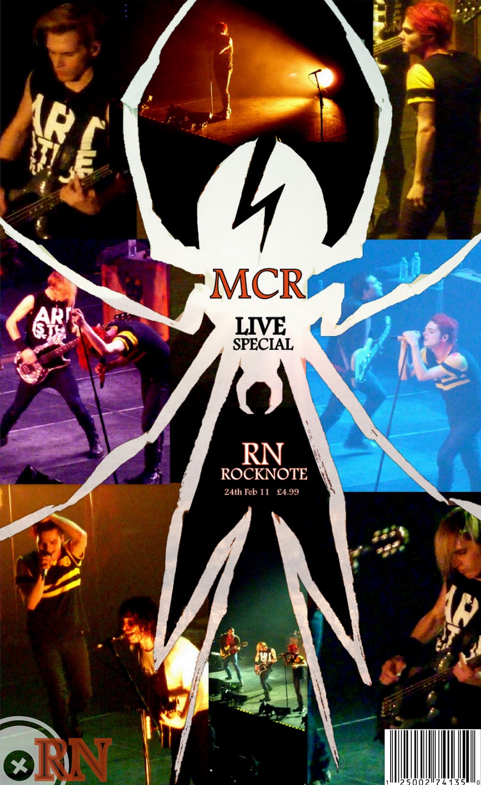
1 - My first idea is to do a My Chemical Romance Live Special, as I went to 3 of their gigs and took a collection of photos from them. I uploaded these photos and edited some of them by cropping to a nice shape for a magazine, and editing the contrast etc to make them stand out more. The OFC would be a collage of my photos, with some kind of separator to avoid looking a mess. The contents page would be headed with another MCR photo, but would also include other photos I will take, with either real bands, or my friends posing as artists. The main feature would predominantly be a live review from their World Contamination Tour; however there would also be news about them, a merchandise section I would design, and maybe a section of "bands you may like..." to recommend others, and make an opportunity to use other photos I will take.

2 - My second idea would be to photograph one of my friend's bands; or to get my friends to pose as the artists. This one wouldn't focus entirely on one band, it would probably be a new bands issue, or a end of year overview type thing. It will be either that, or just a normal edition, pretending my friends are already established artists.